Summary
Emily Egan Design used creative simplicity and clear yet intuitive graphic design to amplify the message of Disability Is Human.

Writing a book isn’t just about words. It’s also about designing a publication that reflects your vision, appeals to readers, and elevates the project in ways you might not even see coming.
For Disability Is Human: The Vital Power of Accessibility in Everyday Life, Emily Egan was the ideal collaborator for graphic design and so much more.
The owner and creative visionary behind Emily Egan Design, Emily has been working with Dr. Stephanie W. Cawthon since 2019 — building her brand identity and using colors, fonts, icons, and design excellence to boost every “Team Stephanie” project from keynote speeches to classroom materials.
A Book is Born
So it made sense that, when Dr. Cawthon was nearly finished writing the book, she would reach out to Emily to explain its warm and timely message of access, inclusivity, and understanding.
With creative simplicity and clear yet intuitive graphic design, Emily created all of the artwork and design elements for Disability Is Human.
Using high-contrast colors and intentional graphics, her hand-drawn icons and patterns are featured throughout in the book, workbook and in a cohesive merchandise collection that taps into the movement and viral message of the book’s title.
The Accidentally Intentional Cover Design
![]() The unique front cover artwork Emily designed came from a little experiment she did during a brainstorming session in her home studio in Phoenix, Arizona.
The unique front cover artwork Emily designed came from a little experiment she did during a brainstorming session in her home studio in Phoenix, Arizona.
“I scribbled randomly on the page, but in one continuous line. When I was done it looked like a big mess. To organize the mess, I started taking each point of the line and straightening it out, which turned into an imperfect spiral,” recalls Emily.
She put the imperfect spirals into ‘square-drops’ — squares with three rounded corners and one square corner — used in other projects for Stephanie.
Emily explains the visual representation of the imperfect spirals is that the “work” of accessibility has no end or beginning. Building an accessible world requires us to reimagine more than just access. For many people, it can mean working in (or starting from) a raw place.
Ultimately, an imperfect spiral reminds us to use our core humanity as a guide.
The Power of Change
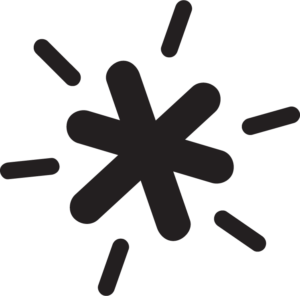
 Another intuitive design example in Disability Is Human is the “star” icon sprinkled throughout the book and are used to represent the Creator Call-Outs that amplify disabled thought leaders.
The star icon reflects the fact that humans are complex and simple at the same time, forever holding within the power of change.
“The star resembles a stick figure of a body with two lines in the place of a head — holding dualities and shining them forward,” said Emily. “When we focus our energy intentionally and realistically, we can begin to heal. The square with the lines is intended to be a nod to the workbook and Stephanie’s idea that accessibility is a ‘to-be’ list, not a ‘to-do’ list.”
As with all of Emily’s designs, they are accessible to a wide range of people to create an inclusive experience for everyone, including people who are blind, low vision, deaf, hard of hearing, or have any disabilities.
That includes selecting fonts for their readable and timeless appeal, as well as meeting ADA standards for accessibility.
